The Brief
The Big Taquero needed a site that felt as distinctive as the food and the setting. This was not a quiet restaurant brochure. It had to capture the character of a Mexican street-food spot based at Unit 23 Skatepark in Dumbarton, while still making the practical details easy to find on a phone.
The job was to turn a high-energy food brand into a focused single-page experience: menu, opening hours, story, gallery, merch, booking enquiries, contact details, social links, and enough search metadata for the site to work properly beyond the first impression.
Creative Direction
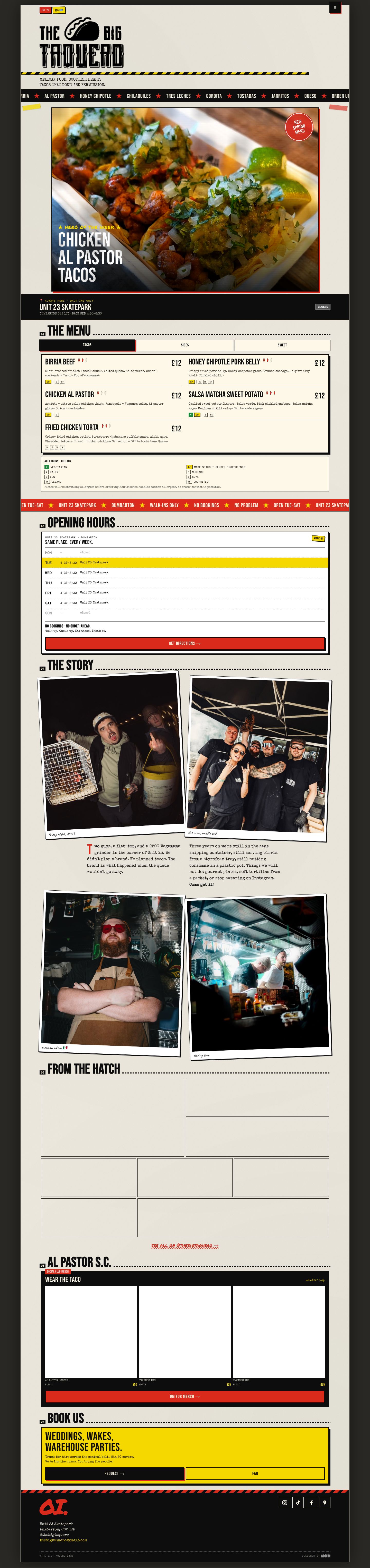
The visual direction leans into food-truck confidence and skatepark texture. Paper grain, hazard tape, stamped labels, bold red and yellow accents, rough-edged details, and oversized menu typography give the site a hand-made, punk-zine feel without losing the structure customers need.
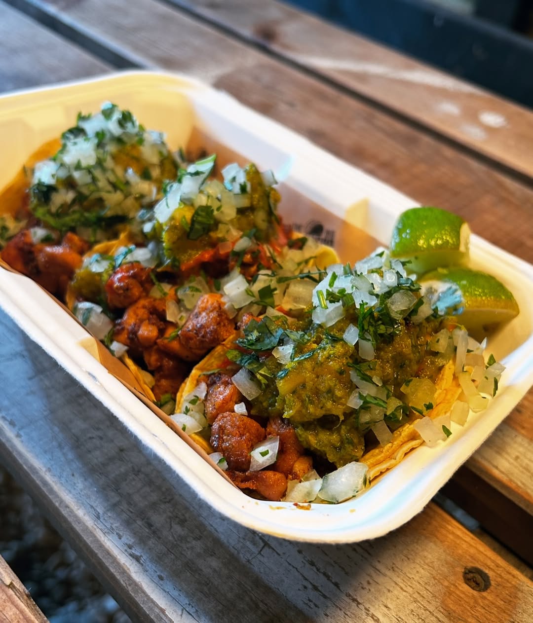
The design keeps the menu at the centre of the experience. Food photography, tabbed menu sections, opening-status messaging, and location details are all brought forward so visitors can understand what is on, where to go, and when to show up without digging through a conventional restaurant layout.
What Was Built
The site is a lightweight static build with no framework dependency and no build step. That kept the project fast, portable, and easy to maintain for a small food business.
The finished experience includes:
- A mobile-first single-page layout
- Menu category tabs for tacos, sides, and sweet items
- Live opening-status messaging based on the current schedule
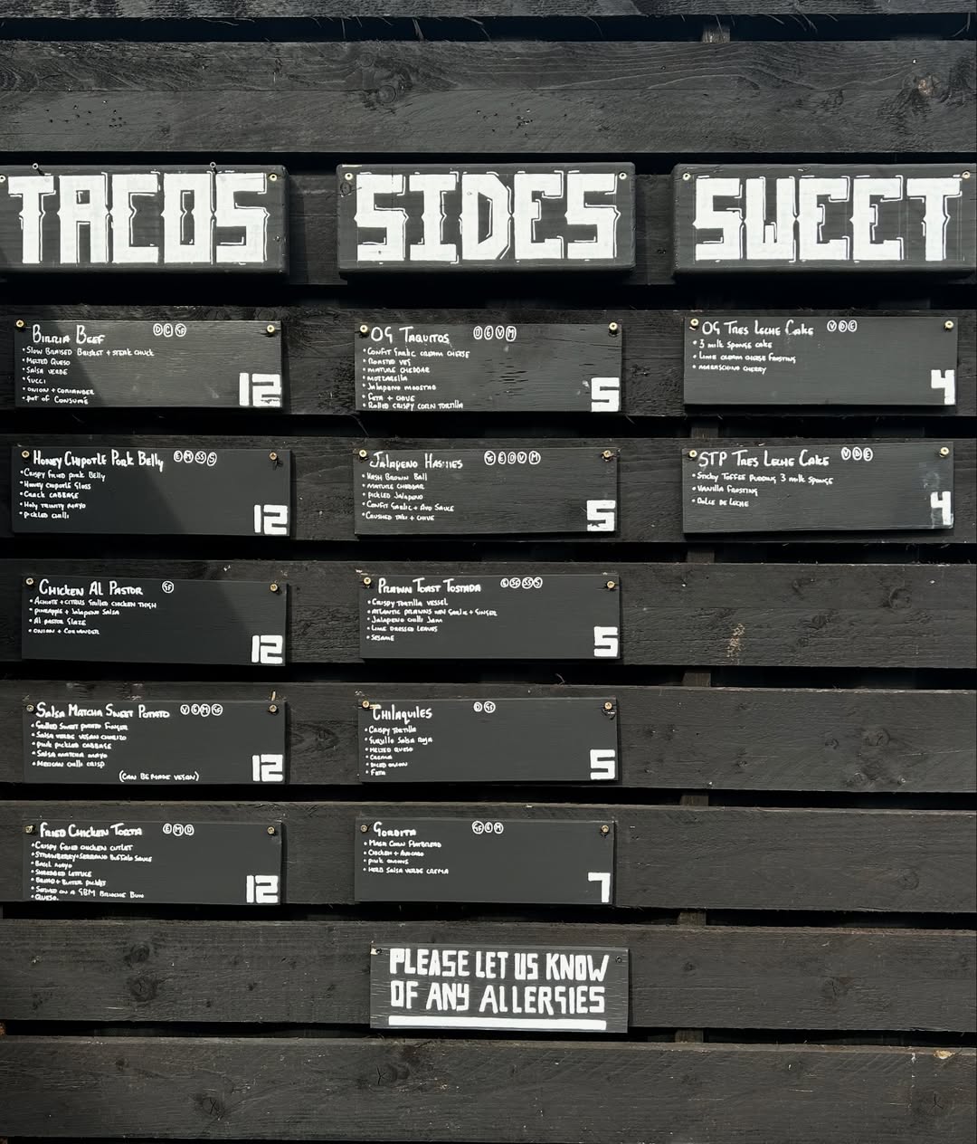
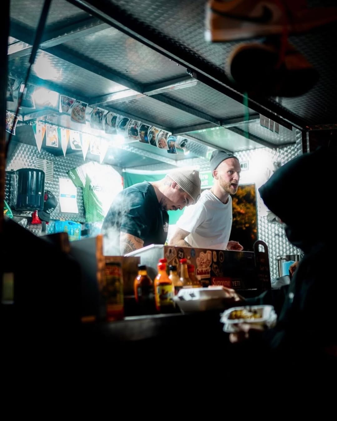
- Story, gallery, merch, booking enquiry, contact, and social sections
- Restaurant SEO metadata and structured data
- A visual system built around real brand and food photography
The interaction layer stays deliberately focused. The navigation drawer, menu tabs, status strip, and marquee movement add energy, but the site still behaves like a practical customer tool rather than a novelty landing page.
Why It Works
The strongest part of the project is the balance between personality and utility. The site has enough bite to feel like The Big Taquero, but the important information remains immediate: what is on the menu, where the truck is, whether it is open, and how to get in touch.
For a food business with a strong local following, that matters. The website gives the brand a proper home online without sanding off the rough edges that make it memorable.