The Brief
Lomond Tech Services needed more than a website refresh. The business was building out a clearer offer for small businesses that need dependable IT support, cybersecurity, cloud admin, backup, and day-to-day technical oversight, but the brand did not yet have the authority or consistency to support that positioning properly.
This project therefore had two jobs at once: create an identity that felt professional, modern, and dependable, then carry that system through into a website that could explain the service offer clearly and turn credibility into enquiries.
Creative Direction
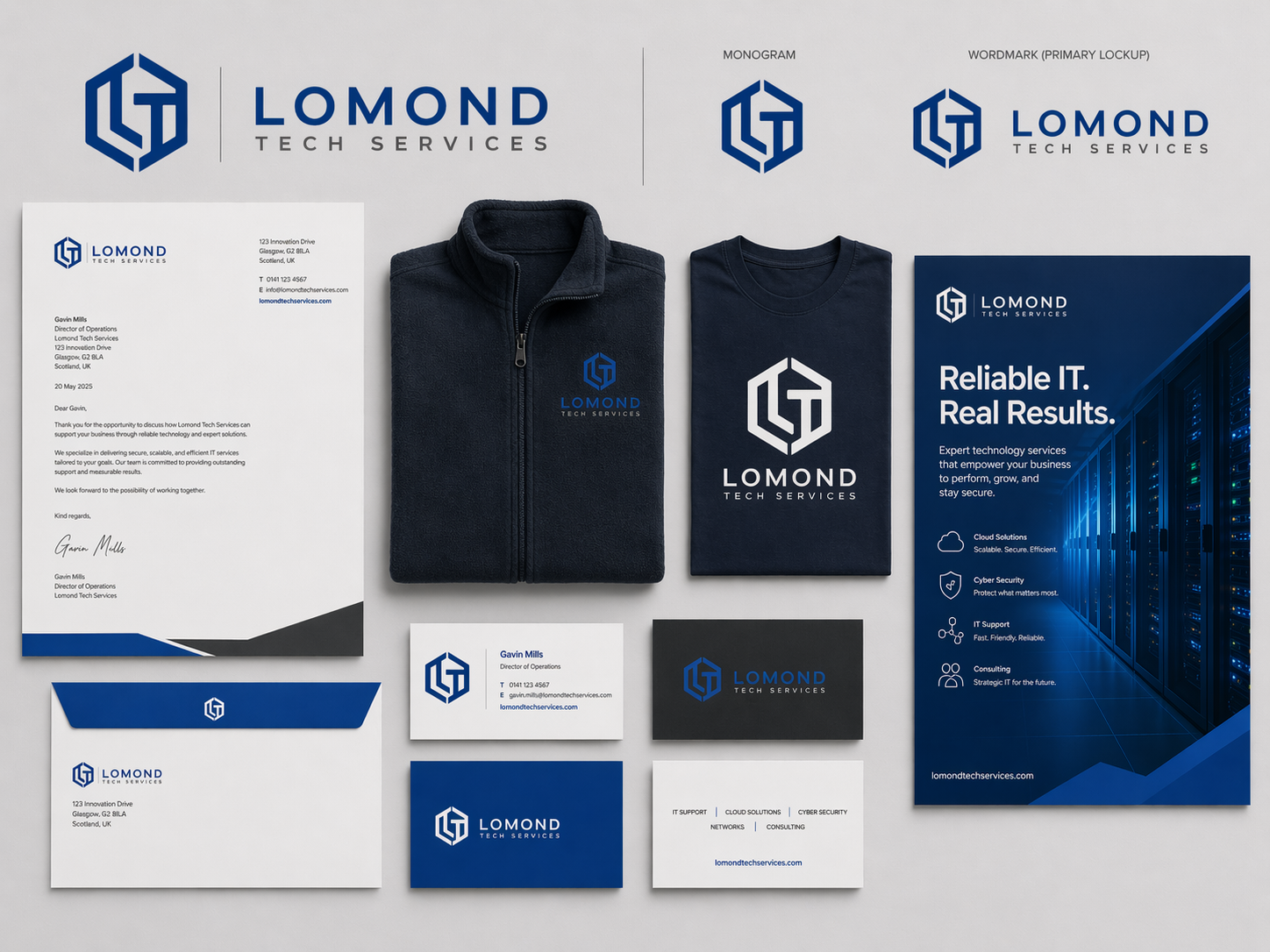
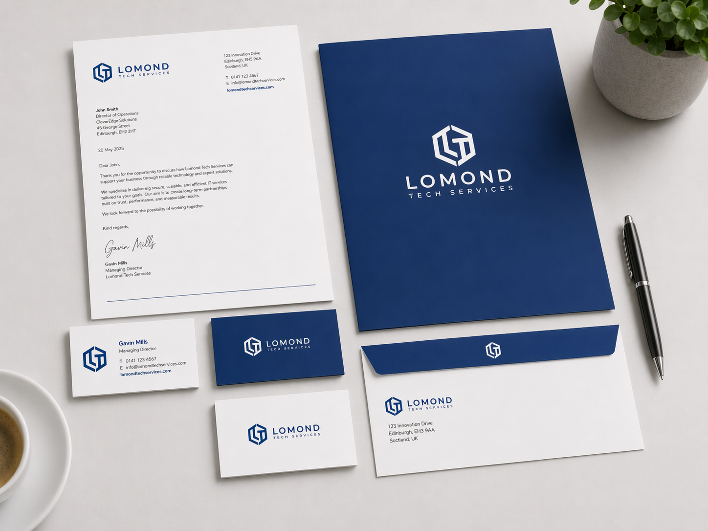
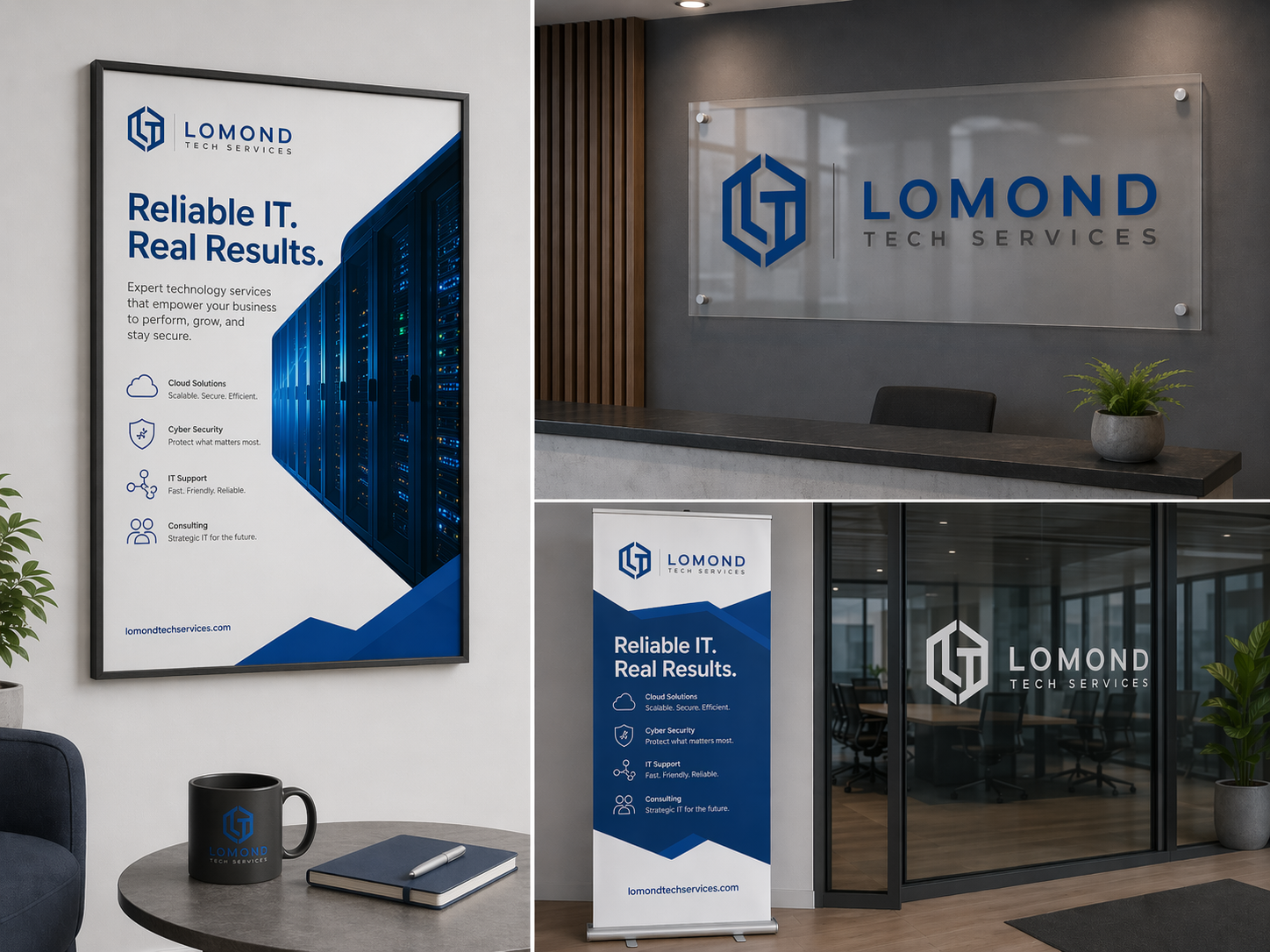
The visual direction combines a sharper identity system with a website aesthetic that feels technical without becoming cold or overdesigned. The logo mark uses a compact monogram structure that gives LTS a recognisable symbol across digital and physical touchpoints, while the wider palette stays rooted in deep navy, strong electric blue, and clean white.
That combination was important. The business needed to look capable enough for infrastructure, security, and support work, but still approachable to owner-managers and small teams who are usually buying clarity and trust rather than enterprise jargon. Across both the identity and the site, the goal was to make LTS feel reliable, organised, and easy to engage.
What Was Built
The project included a full identity and launch-ready digital presence:
- Logo design and primary wordmark / monogram lockups
- A visual system for web, print, signage, and branded apparel
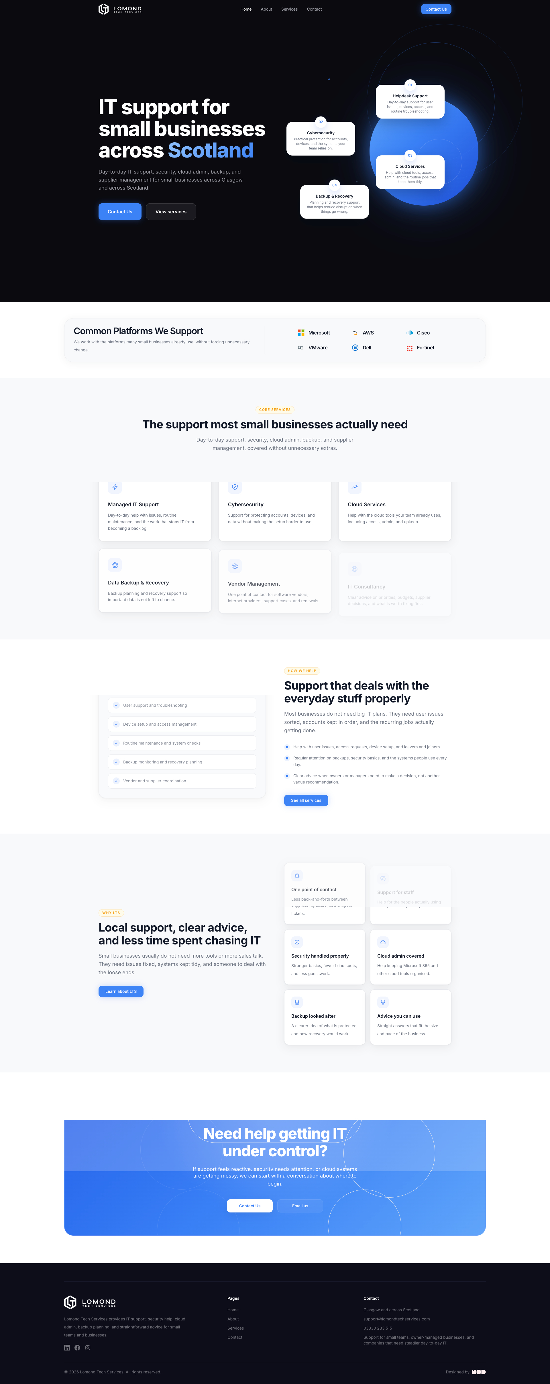
- A brochure-style website covering home, about, services, and contact
- Service positioning and page structure focused on clarity over technical noise
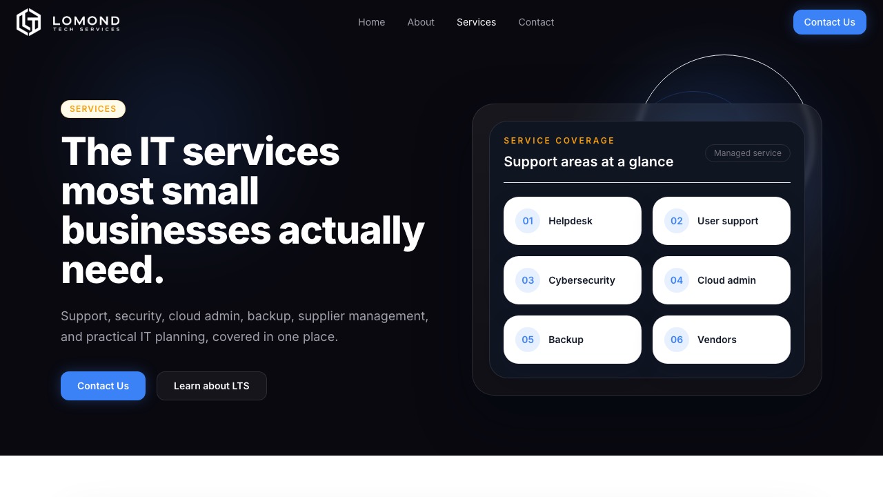
The website is structured around the practical questions potential clients usually have: what support is covered, whether the business understands smaller teams properly, and what happens when they make contact. Core services are grouped into familiar, useful buckets such as managed IT support, cybersecurity, cloud services, backup and recovery, vendor management, and consultancy, with supported platforms surfaced to reinforce real-world capability.
The contact flow is handled as part of the product thinking too. Rather than treating contact as a dead-end footer block, the site gives direct routes, sets expectations clearly, and makes it easier for a prospect to explain team size, current issues, and support needs in a way that leads to a better first conversation.
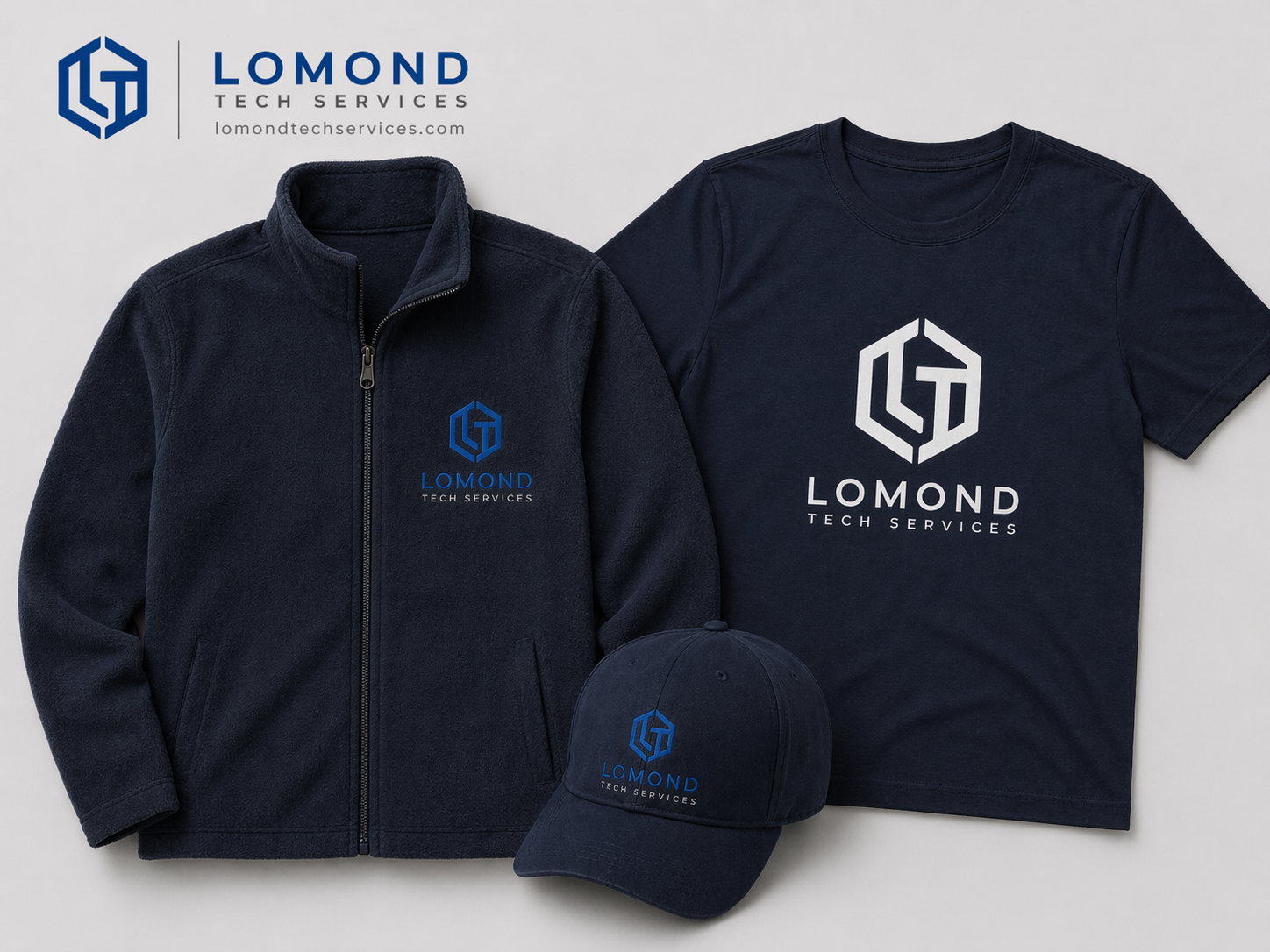
Identity Rollout
The identity system was designed to work well beyond the website itself. Stationery, signage, printed materials, and apparel all carry the same sense of order and confidence, which matters for a service business that often has to build trust before any technical conversation even begins.
That wider rollout gives the business a more coherent presence. Instead of the website feeling like a one-off design exercise, the branding and collateral now present LTS as a consistent, considered business across every touchpoint.
Why It Works
The strongest part of the project is that the brand and website now reinforce each other. The identity gives Lomond Tech Services a more ownable presence, while the site translates that into a clear, low-friction explanation of what the business does and why it is useful.
Together, that makes LTS feel practical, modern, and credible without drifting into generic MSP language or stock-tech styling. It looks like a business that can organise problems, communicate clearly, and show up consistently online and offline.